Création du packaging Pure Soda Bio
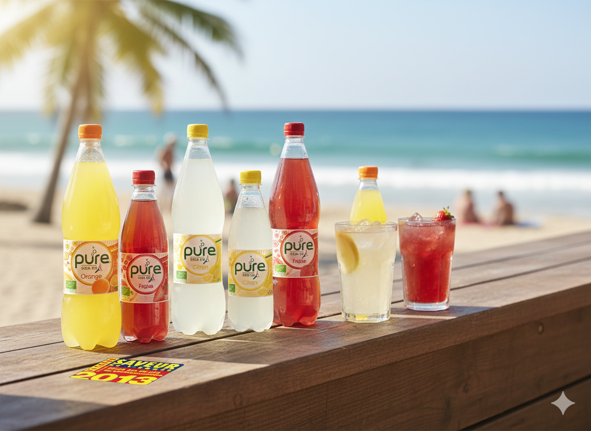
Une gamme colorée, bio et rafraîchissante pensée pour séduire dès le premier regard.
Une collaboration pétillante
Dans le cadre du lancement de la gamme Pure Soda Bio, la marque a fait appel à DragonStudio pour concevoir un packaging moderne, naturel et attractif.
Objectif : créer une identité visuelle claire pour cette boisson pétillante 100% bio, avec une déclinaison cohérente pour chaque parfum (orange, fraise, citron).
Notre travail sur ce projet :
Création des étiquettes produit :
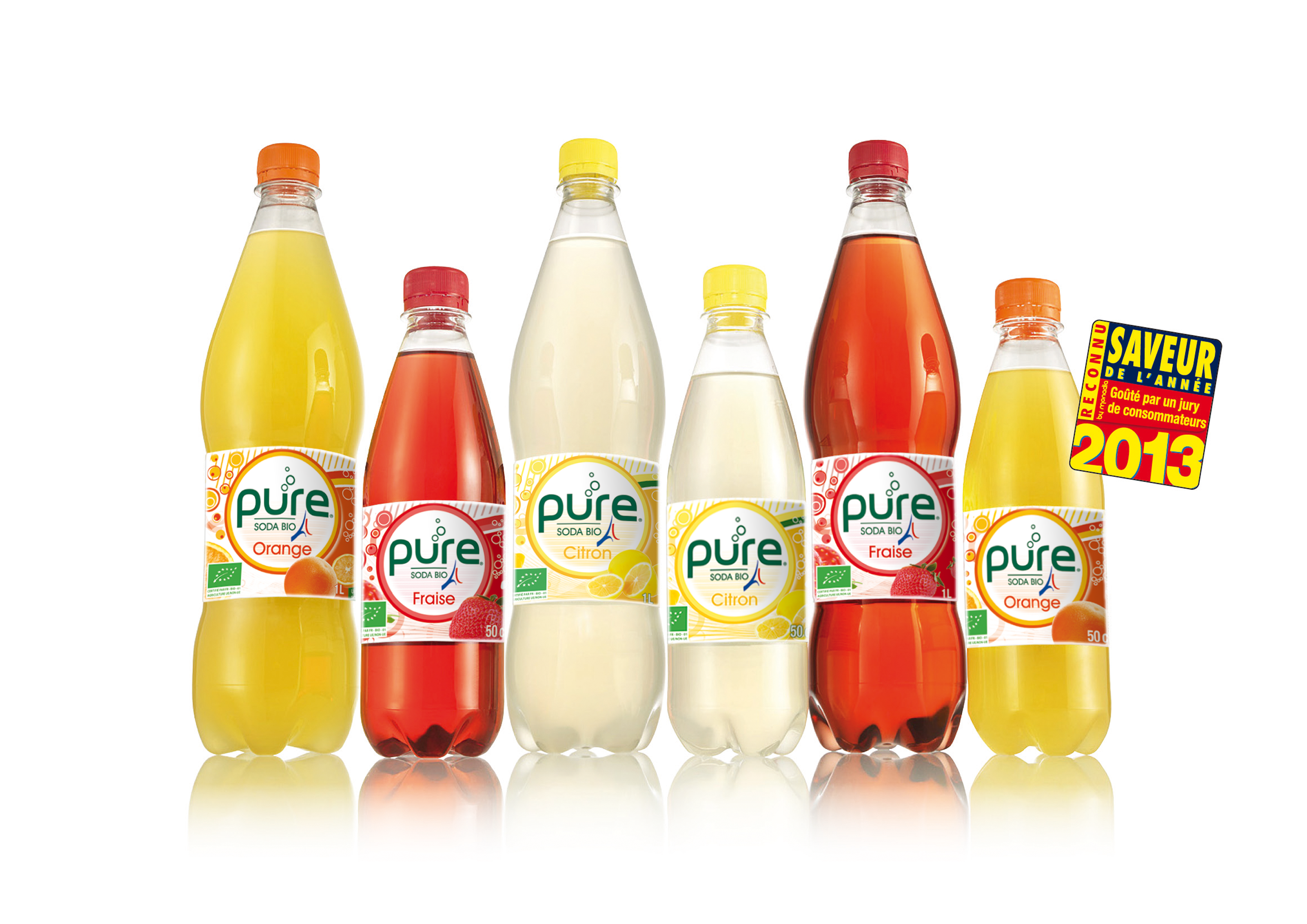
- Conception graphique des étiquettes pour les différents formats (50cl / 1L)
- Déclinaison par code couleur et fruit illustré pour chaque saveur
- Respect des normes de lisibilité et d’étiquetage alimentaire
- Intégration des mentions légales et des logos certifiés (bio, recyclage, etc.)
Travail d’illustration et de composition :
- Choix d’un design circulaire central évoquant la pureté et les bulles
- Travail sur la fraîcheur et la légèreté à travers le fond blanc et les touches de couleur
- Ajout de motifs fruités dynamiques pour renforcer l’appétence visuelle
Préparation pour impression :
- Livrables en haute définition pour les imprimeurs
- Respect des gabarits, marges techniques et zones de sécurité
- Tests d’intégration sur différents supports (PET, verre)
Une reconnaissance grand public
La gamme Pure Soda Bio a été reconnue « Saveur de l’année 2013 », validée par un panel de consommateurs. Une belle récompense pour un produit pensé à la fois dans le goût et dans le design !
A colorful, organic, and refreshing range designed to captivate at first glance
A sparkling collaboration
As part of the launch of the Pure Soda Bio range, the brand partnered with Dragon Studio to design modern, natural, and eye-catching packaging.
The objective was to create a clear and cohesive visual identity for this 100% organic sparkling beverage, with a consistent variation for each flavor (orange, strawberry, lemon).
Our work on this project:
Product label design:
• Graphic design of labels for different formats (50cl / 1L)
• Flavor differentiation through color coding and illustrated fruits
• Compliance with readability standards and food labeling regulations
• Integration of legal information and certified logos (organic, recycling, etc.)
Illustration and layout work:
• Selection of a central circular design evoking purity and bubbles
• Emphasis on freshness and lightness through a white background and subtle color accents
• Addition of dynamic fruity patterns to enhance visual appeal
Print preparation:
• High-definition deliverables for printers
• Compliance with templates, technical margins, and safety zones
• Integration tests across various media (PET, glass)
Public recognition
The Pure Soda Bio range was awarded “Flavor of the Year 2013”, validated by a consumer panel. A great achievement for a product designed with equal attention to taste and visual identity!
