Création du logo & charte graphique pour le restaurant japonais O’WOKSUSHI
Traiteur & restaurant de sushi — Boulogne-Billancourt (92100)
Une identité visuelle épurée et percutante
Pour accompagner l’ouverture du restaurant japonais O’WOKSUSHI à Boulogne-Billancourt, j’ai été sollicité pour créer une identité visuelle complète, avec pour mission de capturer l’essence de la cuisine japonaise tout en offrant une touche contemporaine et accessible.
Le point de départ : un logo emblématique capable d’évoquer à la fois l’authenticité culinaire, la fraîcheur des produits, et l’énergie d’un lieu moderne et accueillant.
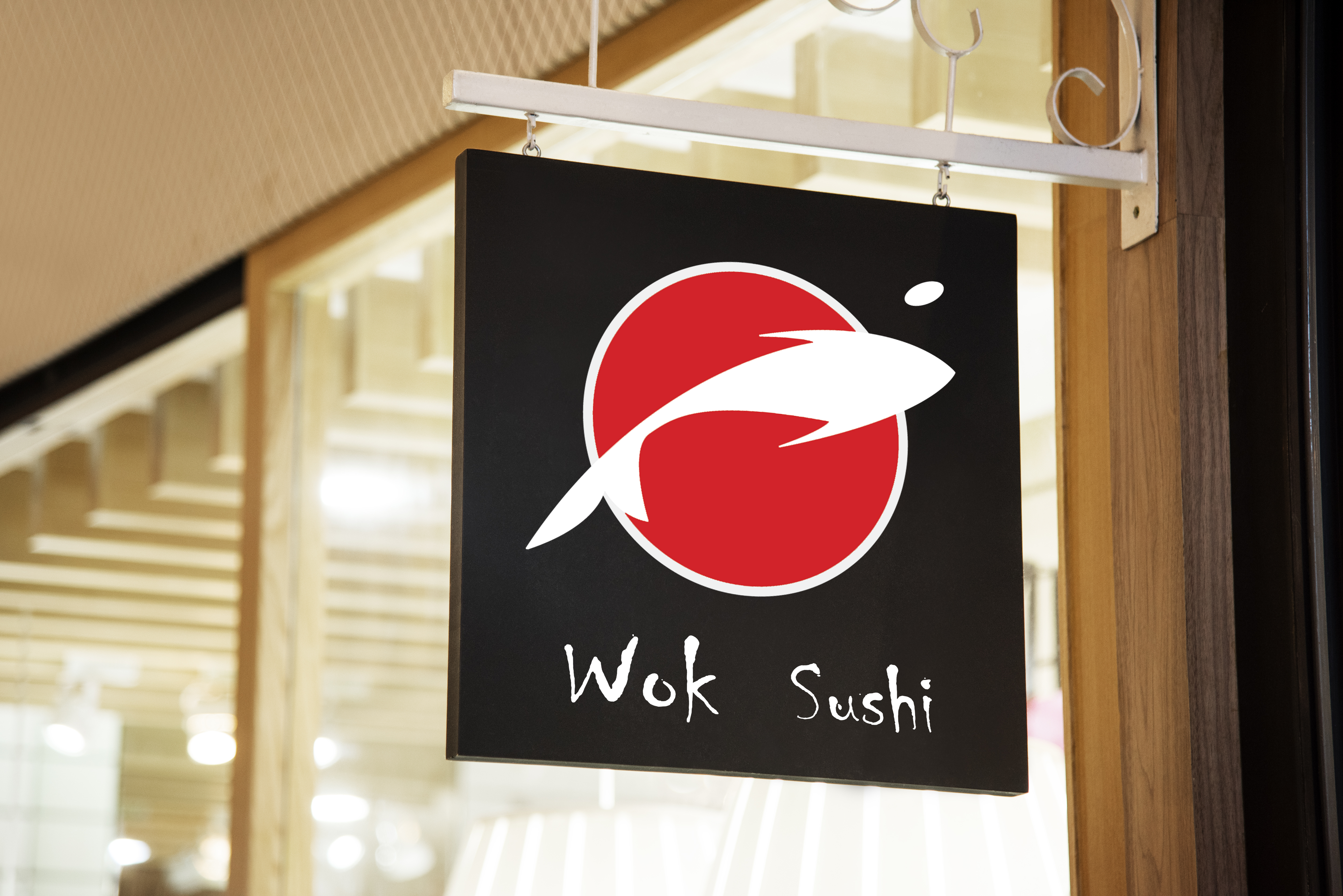
Le logo : entre tradition et modernité
Le logo s’articule autour d’un pictogramme minimaliste représentant un poisson stylisé, inscrit dans un cercle rouge évoquant à la fois le soleil levant du drapeau japonais et la perfection du sushi. Le mouvement dynamique du poisson suggère à la fois la légèreté, la précision du geste culinaire, et l’idée de fraîcheur, essentielle dans le monde du sushi.
Couleurs choisies :
– Rouge profond : pour sa puissance symbolique (soleil, vitalité, passion)
– Blanc et noir : pour la pureté, l’élégance et la lisibilité
La typographie manuscrite, volontairement irrégulière et organique, vient renforcer l’aspect artisan, fait-main, tout en gardant une signature visuelle originale.
Une charte graphique adaptée à tous les supports
En plus du logo, une charte graphique complète a été développée :
– Déclinaisons du logo pour les enseignes, packagings, menus et supports digitaux
– Sélection de typographies secondaires harmonieuses
– Palette colorée complémentaire (rouges, tons naturels, nuances de gris)
– Guide d’utilisation pour une cohérence sur tous les supports print et web
Objectif : permettre au restaurant de communiquer efficacement sur tous les supports tout en conservant une identité forte, reconnaissable et professionnelle.
O’WOKSUSHI : plus qu’un restaurant, une expérience
Installé à Boulogne-Billancourt, O’WOKSUSHI propose une cuisine japonaise soignée, à la croisée des chemins entre tradition nippone et modernité urbaine. L’image de marque développée reflète ce positionnement, en combinant élégance graphique et évocation sensorielle.
Client : O’WOKSUSHI
Mission : Création du logo, identité visuelle & charte graphique complète
Localisation : Boulogne-Billancourt – 92100
Logo & Visual Identity Creation for the Japanese Restaurant O’WOKSUSHI
Catering & Sushi Restaurant — Boulogne-Billancourt (92100)
A Clean and Impactful Visual Identity
To support the opening of the Japanese restaurant O’WOKSUSHI in Boulogne-Billancourt, I was commissioned to create a complete visual identity, with the objective of capturing the essence of Japanese cuisine while offering a contemporary and accessible touch.
The starting point: an emblematic logo capable of conveying culinary authenticity, product freshness, and the energy of a modern, welcoming venue.
The Logo: Between Tradition and Modernity
The logo is built around a minimalist pictogram representing a stylized fish, enclosed within a red circle that evokes both the rising sun of the Japanese flag and the perfection of sushi. The dynamic movement of the fish suggests lightness, precision in culinary craftsmanship, and the notion of freshness—essential in the world of sushi.
Chosen colors:
- Deep red: for its strong symbolism (sun, vitality, passion)
- White and black: for purity, elegance, and readability
The handwritten typography, deliberately irregular and organic, reinforces the artisanal, handmade aspect while maintaining a distinctive and original visual signature.
A Graphic Charter Adapted to All Media
In addition to the logo, a complete graphic charter was developed:
- Logo variations for signage, packaging, menus, and digital media
- Selection of harmonious secondary typefaces
- Complementary color palette (reds, natural tones, shades of gray)
- Usage guidelines to ensure consistency across all print and web materials
Objective: to enable the restaurant to communicate effectively across all platforms while maintaining a strong, recognizable, and professional identity.
O’WOKSUSHI: More Than a Restaurant, an Experience
Located in Boulogne-Billancourt, O’WOKSUSHI offers refined Japanese cuisine at the crossroads of traditional Japanese heritage and urban modernity. The brand image developed reflects this positioning, combining graphic elegance with sensory evocation.
Client: O’WOKSUSHI
Mission: Logo creation, visual identity & complete graphic charter
Location: Boulogne-Billancourt – 92100
