Création du logo La Vigne en Ville
Bar à vin bio – Paris
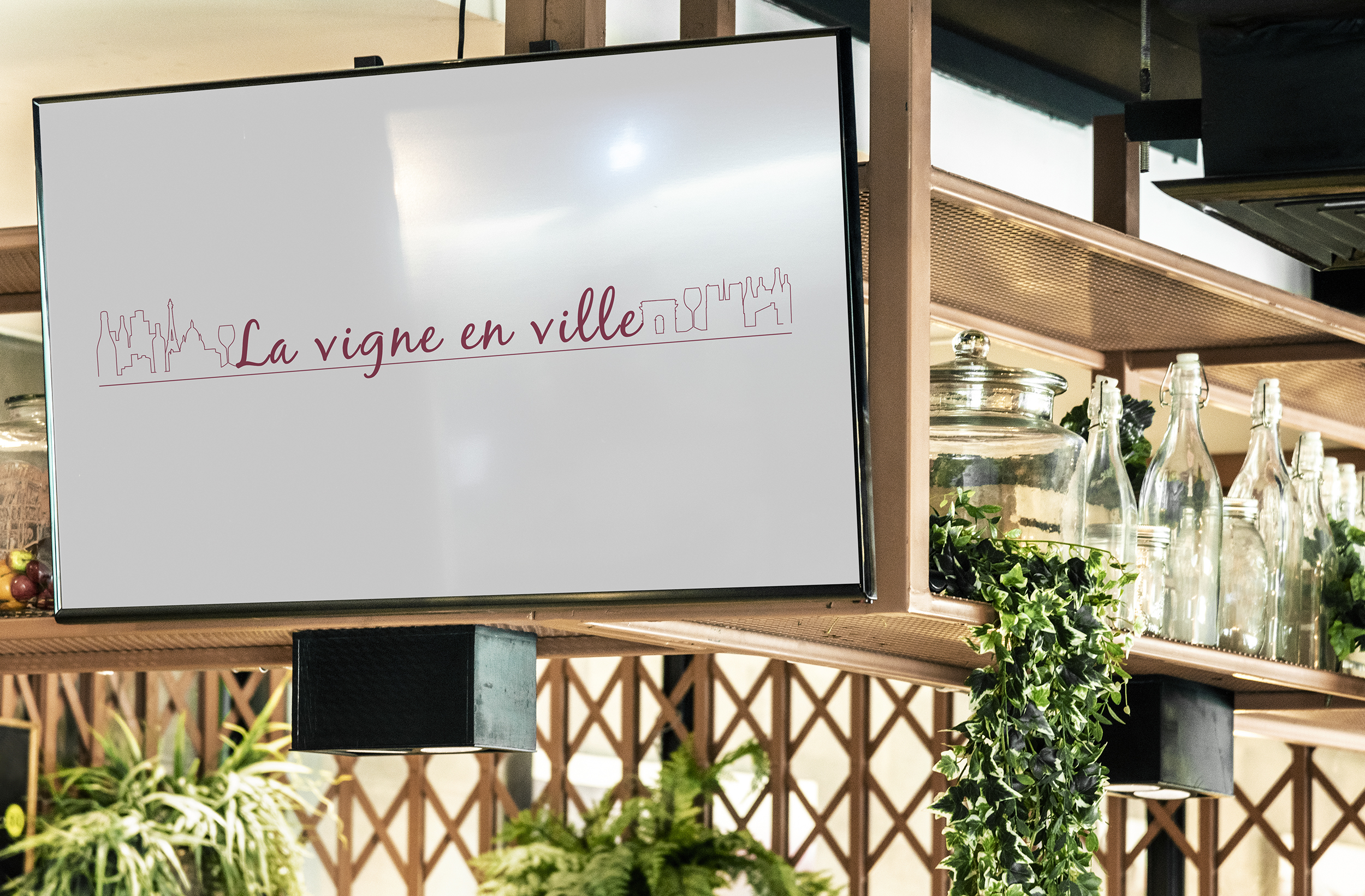
Un logo qui allie nature, architecture et terroir
Pour accompagner le lancement du bar à vin bio “La Vigne en Ville”, situé en plein cœur de Paris, nous avons conçu une identité visuelle sobre, élégante et urbaine — à l’image du lieu. L’objectif était clair : suggérer le lien entre nature et ville, entre culture viticole et convivialité citadine.
Une ligne graphique qui raconte une histoire
Le logo repose sur une ligne continue, évoquant à la fois une skyline urbaine et un paysage viticole stylisé. On y devine subtilement :
– Des immeubles, une cathédrale, un clocher…
– Une bouteille, un verre, un chai ou un fût…
Cette silhouette dessinée en filigrane crée un jeu graphique équilibré, où l’univers de la ville et celui du vin fusionnent dans un esprit à la fois contemporain, artisanal et poétique.
Une typographie manuscrite, pour plus d’humanité
Le nom La Vigne en Ville est écrit dans une typographie cursive fluide, qui apporte une touche chaleureuse et humaine. Elle vient contraster avec la rigueur de la ligne graphique pour refléter la convivialité du lieu, ses échanges et son esprit de proximité.
La couleur bordeaux choisie évoque bien sûr le vin, mais aussi la chaleur, l’authenticité et l’engagement dans une démarche bio et responsable.
Une identité adaptable et durable
Le logo a été pensé pour s’adapter à de nombreux supports :
– Enseigne, étiquette, carafe, ardoise
– Communication digitale (Instagram, newsletter)
– Supports imprimés (carte des vins, flyer, tote bag)
Cette identité visuelle modulable permet au bar de se démarquer dans un univers concurrentiel tout en gardant une image forte, identifiable et fidèle à ses valeurs.
Client : La Vigne en Ville
Mission : Création du logo et définition de l’identité visuelle
Secteur : Bar à vin bio – Paris
Creation of the “La Vigne en Ville” Logo
Organic Wine Bar – Paris
A logo combining nature, architecture, and terroir
To support the launch of the organic wine bar La Vigne en Ville, located in the heart of Paris, we designed a visual identity that is clean, elegant, and urban—reflecting the spirit of the venue itself. The objective was clear: to suggest the connection between nature and the city, between wine culture and urban conviviality.
A graphic line that tells a story
The logo is built around a continuous line, evoking both an urban skyline and a stylized vineyard landscape. Within this subtle silhouette, one can discern:
– Buildings, a cathedral, a bell tower…
– A bottle, a glass, a wine cellar or a barrel…
This line-drawn composition creates a balanced visual interplay, where the world of the city and the world of wine merge into a contemporary, artisanal, and poetic aesthetic.
Handwritten typography for a human touch
The name La Vigne en Ville is rendered in a flowing handwritten script, adding warmth and humanity to the identity. It contrasts with the precision of the graphic line, reflecting the venue’s convivial atmosphere, sense of exchange, and closeness.
The chosen burgundy color naturally evokes wine, while also conveying warmth, authenticity, and a commitment to organic and responsible values.
A flexible and lasting identity
The logo was designed to adapt seamlessly across a wide range of applications:
– Signage, labels, carafes, chalkboards
– Digital communication (Instagram, newsletters)
– Printed materials (wine lists, flyers, tote bags)
This modular visual identity allows the bar to stand out in a competitive environment while maintaining a strong, recognizable image that remains true to its values.
Client: La Vigne en Ville
Mission: Logo creation and visual identity development
Sector: Organic wine bar – Paris
