
Création de 25 pictogrammes sur mesure pour Axentia
Une collaboration fidèle et engagée depuis 2014
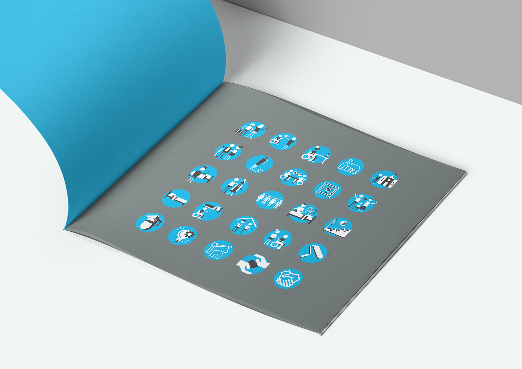
Depuis près de 10 ans, nous avons le plaisir d’accompagner Axentia, acteur essentiel du logement social thématique, dans le développement de son identité visuelle. Dans le cadre de l’évolution de leur structure, nous avons conçu une série de 25 pictogrammes originaux, adaptés à leur communication institutionnelle, mais aussi à leur usage interne.
Axentia : une entreprise sociale à visage humain
Membre du Groupe Habitat en Région, Axentia n’est pas une ESH comme les autres. Elle se distingue par son engagement auprès des publics les plus fragilisés : personnes âgées dépendantes, personnes en situation de handicap, jeunes en rupture, étudiants précaires… En apportant des réponses concrètes à des besoins spécifiques, elle transforme le logement en véritable outil d’inclusion sociale.
Récemment, Axentia a franchi un cap stratégique avec la reprise de 93 établissements auparavant gérés par SIGH. Cette évolution structurelle a nécessité la création de nouveaux supports visuels pour accompagner l’arrivée de la première Direction Territoriale à Douai.
Un travail de design sur mesure et cohérent
Le défi était de créer un ensemble de pictogrammes à la fois modernes, lisibles et cohérents entre eux, capables de représenter une grande diversité de thématiques :
- publics concernés (personnes âgées, étudiants, personnes en situation de handicap…),
- services proposés,
- notions clés du secteur médico-social et de l’habitat spécialisé,
- repères graphiques pour des supports pédagogiques ou institutionnels.
Des pictogrammes fonctionnels et identitaires
Pensés pour une utilisation multi-supports (brochures, kakemonos, signalétique, supports digitaux…), ces pictos respectent la charte graphique d’Axentia tout en apportant une touche de fraîcheur et de clarté à leurs communications.
Le choix d’un code couleur simple (bleu et blanc sur fond gris neutre) renforce l’unité visuelle, tout en permettant une identification rapide des thématiques abordées.
Creation of 25 Custom Pictograms for Axentia
A Trusted and Committed Partnership Since 2014
For nearly 10 years, we have had the pleasure of supporting Axentia, a key player in thematic social housing, in the development of its visual identity. As part of the evolution of their organization, we designed a series of 25 original pictograms, tailored both to their institutional communication needs and to internal use.
Axentia: A Human-Centered Social Enterprise
A member of the Habitat en Région Group, Axentia is not a typical Social Housing Enterprise (ESH). It stands out for its strong commitment to the most vulnerable populations: dependent elderly people, individuals with disabilities, at-risk youth, and underprivileged students. By providing concrete solutions to specific needs, Axentia transforms housing into a true tool for social inclusion.
Recently, Axentia reached a strategic milestone with the acquisition of 93 facilities previously managed by SIGH. This structural development required the creation of new visual materials to support the launch of its first Territorial Directorate in Douai.
A Bespoke and Coherent Design Approach
The challenge was to create a set of pictograms that are modern, legible, and visually consistent, capable of representing a wide range of themes, including:
- Target audiences (elderly people, students, individuals with disabilities, etc.),
- Services provided,
- Key concepts within the medico-social sector and specialized housing,
- Visual markers for educational or institutional materials.
Functional and Identity-Driven Pictograms
Designed for multi-platform use (brochures, roll-up banners, signage, digital media, etc.), these pictograms comply with Axentia’s graphic charter while bringing freshness and clarity to its communications.
The choice of a simple color scheme (blue and white on a neutral gray background) reinforces visual unity while allowing for quick identification of the themes addressed.
