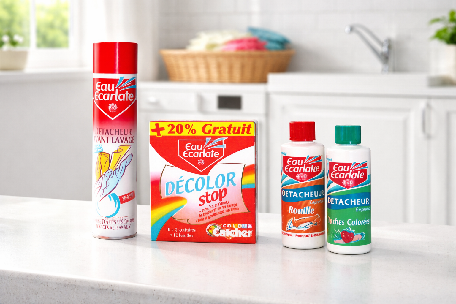
Maquettes et illustrations de packagings pour Eau Écarlate
Eau Écarlate est une marque française de détachants et de produits d’entretien du linge, bien connue des consommateurs pour son efficacité sur les taches du quotidien. La marque faisait partie du groupe Spotless, dont le rachat par Henkel a été annoncé en 2014 et finalisé en 2015. Dragon Studio a réalisé pour elle une série de maquettes et d’illustrations de packagings.
Un packaging qui doit se faire comprendre en un coup d’œil
Dans un rayon de produits d’entretien, l’emballage est le premier vendeur : le consommateur doit identifier en quelques secondes la marque, le type de produit et son usage. Pour une marque de détachants, cela suppose une hiérarchie d’information très claire (nom de la marque, fonction du produit, mentions pratiques), des illustrations qui évoquent immédiatement l’efficacité contre la tache, et une cohérence visuelle forte entre les différentes références de la gamme, pour qu’elles soient reconnaissables d’un même regard.
Notre processus de collaboration avec Eau Écarlate
Chez Dragon Studio, nous croyons en une collaboration étroite avec nos clients pour créer des designs de packaging exceptionnels. Voici comment nous avons travaillé avec Eau Écarlate :
- Compréhension approfondie des besoins : nous avons débuté par une discussion approfondie avec Eau Écarlate pour comprendre ses besoins, ses objectifs et sa vision du packaging de ses produits, ce qui nous a permis d’établir une base solide pour le projet.
- Recherche et inspiration : nous avons étudié la marque ainsi que les tendances actuelles en matière de packaging, pour créer des designs en phase avec son identité.
- Génération de concepts et validation : à partir de nos recherches, nous avons développé plusieurs concepts de maquettes et d’illustrations, présentés à Eau Écarlate pour recueillir ses retours et valider le concept final.
- Développement des designs : une fois le concept validé, nous avons détaillé les designs en intégrant le logo, les informations produit et les éléments visuels, pour des packagings à la fois attrayants et fonctionnels.
- Validation finale et révisions : les designs finaux ont été présentés pour validation, avec des révisions jusqu’à l’approbation finale.
- Finalisation des fichiers et livraison : les fichiers ont été finalisés pour l’impression en tenant compte des spécifications techniques, puis livrés dans les formats nécessaires à la production.
- Suivi et support continu : nous sommes restés en contact tout au long de la production pour nous assurer que le résultat final réponde aux attentes.
Notre processus de collaboration transparent et notre exigence nous permettent de créer des packagings à la hauteur des attentes de nos clients.
Vous avez un projet de packaging ? Contactez-nous pour discuter de vos objectifs de branding et de marketing.
À lire aussi
Voir toutes nos créations print
PURE SODA : création de packaging
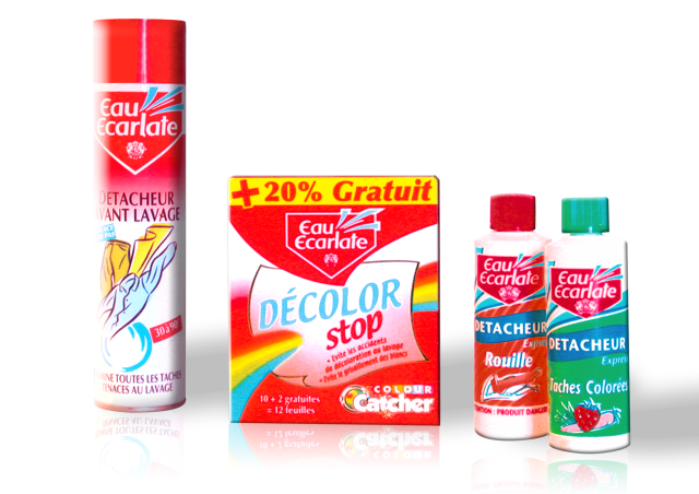
Mockups and Packaging Illustrations for Eau Écarlate
Eau Écarlate is a French brand of stain removers and laundry care products, well known to consumers for its effectiveness on everyday stains. The brand was part of the Spotless Group, whose acquisition by Henkel was announced in 2014 and completed in 2015. Dragon Studio created a series of packaging mockups and illustrations for the brand.
Packaging that has to get its message across at a glance
In a household cleaning aisle, packaging is the first salesperson: shoppers must identify the brand, the type of product and how to use it within seconds. For a stain-remover brand, this means a very clear information hierarchy (brand name, product function, practical details), illustrations that instantly convey effectiveness against stains, and strong visual consistency across the range, so that every reference is recognisable in a single glance.
Our collaboration process with Eau Écarlate
At Dragon Studio, we believe in close collaboration with our clients to create outstanding packaging designs. Here is how we worked with Eau Écarlate:
- In-depth understanding of needs: we began with a detailed discussion with Eau Écarlate to understand its needs, objectives and vision for its product packaging, which gave us a solid foundation for the project.
- Research and inspiration: we studied the brand as well as current packaging trends, in order to create designs aligned with its identity.
- Concept generation and validation: based on our research, we developed several mockup and illustration concepts, presented to Eau Écarlate to gather feedback and validate the final concept.
- Design development: once the concept was validated, we detailed the designs, integrating the logo, product information and visual elements to create packaging that is both attractive and functional.
- Final validation and revisions: the final designs were presented for approval, with revisions made until final sign-off.
- File finalisation and delivery: the files were finalised for print according to technical specifications, then delivered in the formats required for production.
- Follow-up and ongoing support: we stayed in touch throughout production to make sure the final result met expectations.
Our transparent collaboration process and commitment to excellence allow us to create packaging that lives up to our clients’ expectations.
Have a packaging project? Contact us to discuss your branding and marketing goals.

