Étude de cas : la création de l’identité visuelle de Johanna Filiol, naturopathe
Chez Dragon Studio, chaque projet de logo commence par une question simple : qui est la personne ou l’entreprise que l’on doit représenter, et comment lui donner un visage graphique fidèle ? C’est cette question qui a guidé la création de l’identité de Johanna Filiol, naturopathe installée à Garches, dans les Hauts-de-Seine.
Qui est Johanna Filiol ?
Johanna a grandi auprès d’une mère naturopathe, baignée dès l’enfance dans une culture du vivant, de l’alimentation saine et du respect des lois naturelles. Après un parcours dans les métiers de la communication, elle a fait le choix d’une reconversion professionnelle pour transformer cette conviction personnelle en véritable métier.
Aujourd’hui, elle accompagne particuliers et entreprises à travers plusieurs approches complémentaires : des consultations de naturopathie pour retrouver équilibre digestif, sommeil, gestion du stress ou du poids, des ateliers de cuisine végétale conviviaux et gourmands, ainsi que des soins énergétiques pour un recentrage plus subtil. Un fil rouge traverse tout son travail : rendre le bien-être naturel accessible, joyeux et sans dogmatisme.
Le brief : donner un visage à une pratique encore mal comprise
La naturopathie souffre parfois d’une image floue : entre le cabinet médical trop clinique et l’univers « bien-être » trop marketé, il fallait trouver un juste milieu. Johanna avait besoin d’une identité qui inspire immédiatement confiance et sérieux professionnel, tout en restant chaleureuse, humaine et proche de la nature — à l’opposé de l’imagerie froide du monde médical classique.
L’objectif était aussi de concevoir une identité durable et déclinable : carte de visite, site internet, réseaux sociaux, supports imprimés pour ses ateliers de cuisine — un logo qui tienne la route sur tous les formats, du plus petit au plus grand.
Notre démarche créative
Le choix du symbole : le pissenlit
Plutôt que de partir sur les symboles habituels du secteur (feuille, arbre, main ouverte), nous avons cherché une image qui raconte une histoire plutôt qu’elle n’illustre juste un mot-clé. Le pissenlit s’est imposé assez naturellement : c’est une plante que l’on retrouve justement en phytothérapie et en naturopathie pour ses vertus détoxifiantes, mais c’est surtout un symbole universel de transformation — les graines qui s’envolent évoquent le lâcher-prise, le renouveau, la capacité à se régénérer. Une métaphore assez juste du travail que Johanna mène avec ses patients : les accompagner vers un changement en douceur, à leur rythme.
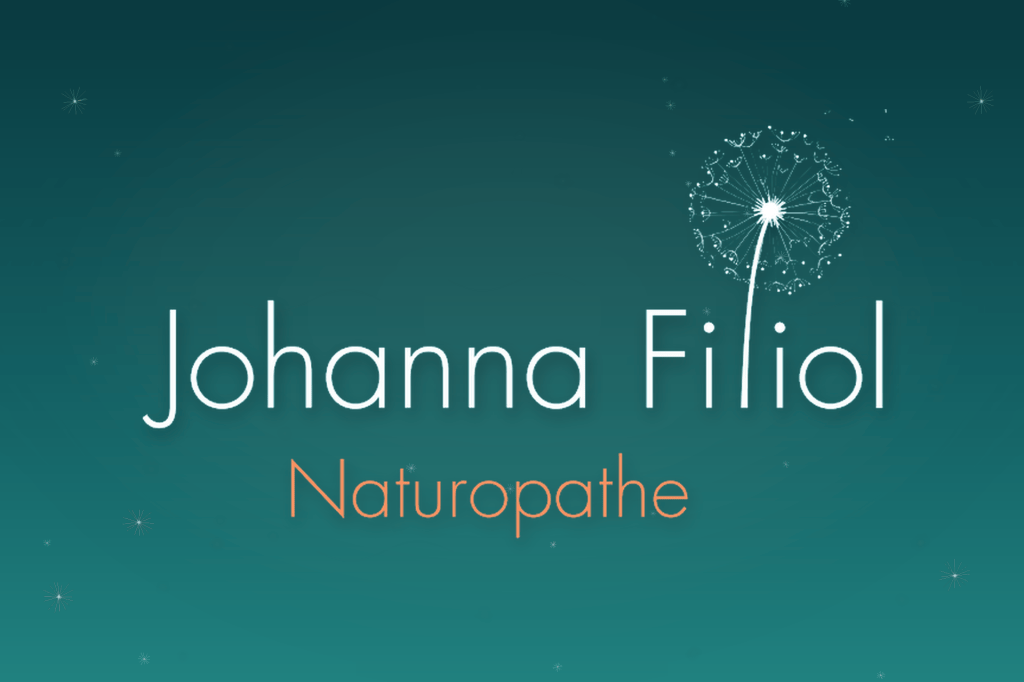
Le dessin final, en fines lignes délicates, reprend cette légèreté : un jeu d’aigrettes suspendues, presque en apesanteur, qui vient équilibrer la rigueur de la typographie en dessous.
Une typographie à deux voix
Le nom « Johanna Filiol » est traité dans une typographie manuscrite fine et fluide, qui apporte une dimension personnelle et humaine — on s’adresse à une personne, pas à une institution. En dessous, « Naturopathe » est composé dans une typographie géométrique épurée, plus structurée, qui ancre le tout dans une forme de sérieux professionnel. Cette double lecture — la signature chaleureuse au-dessus, le métier affirmé en dessous — reflète exactement le positionnement recherché : de la rigueur, sans froideur.
Une palette entre calme et vitalité
Le sarcelle profond a été choisi comme couleur principale : une teinte entre le bleu et le vert, associée à l’eau, à la nature et à l’apaisement, mais suffisamment affirmée pour ne pas tomber dans la mièvrerie du « bien-être pastel ». En contrepoint, une touche de corail apporte la chaleur, l’énergie et la dimension humaine qui manquerait à une palette uniquement froide.
Le résultat
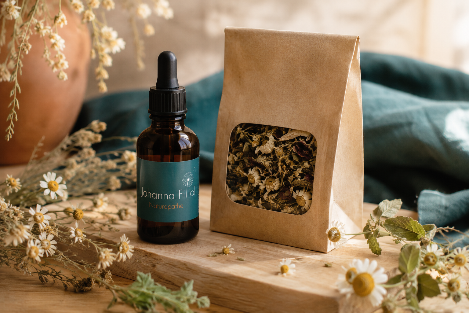
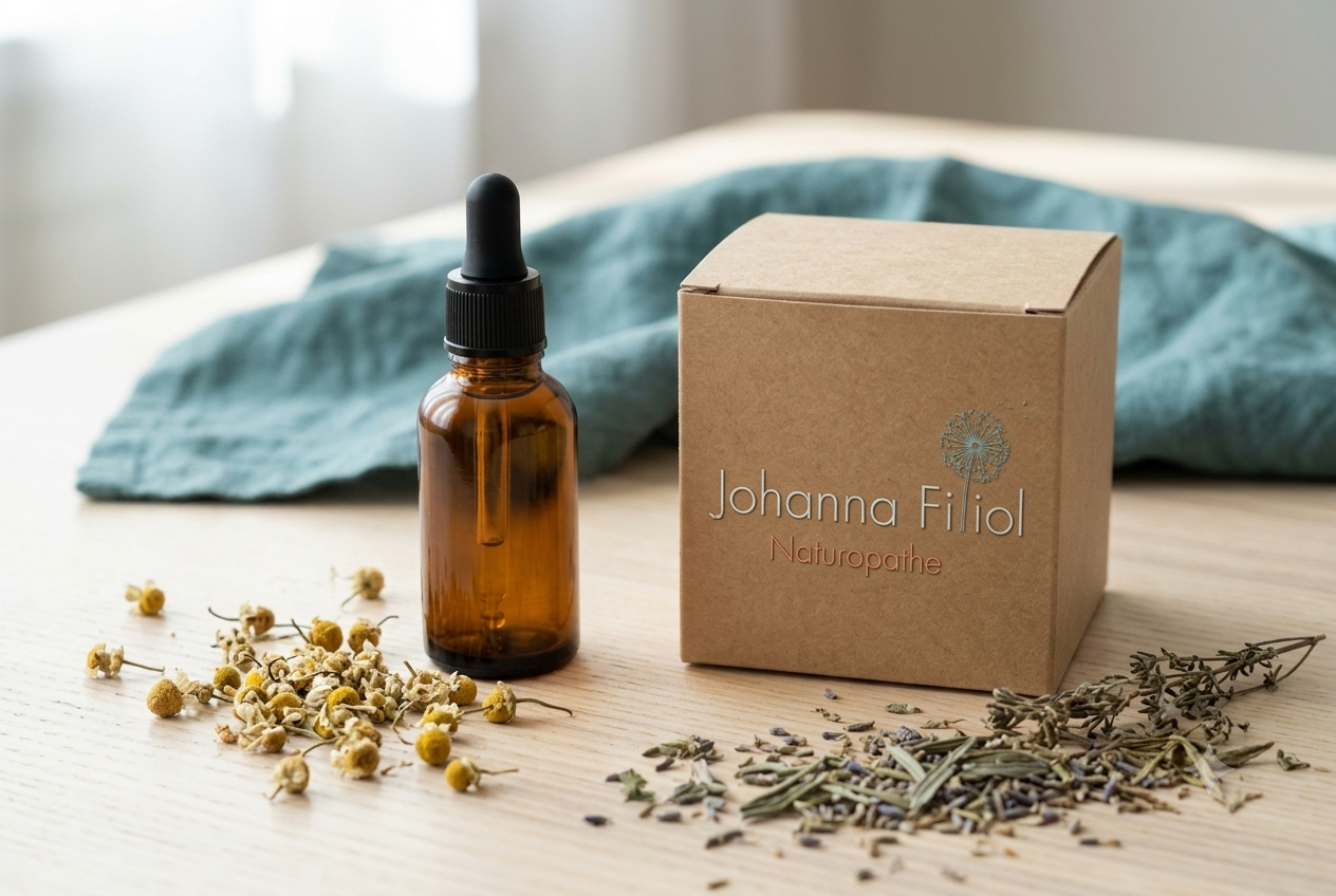
Le logo final tient en une signature simple, lisible à toutes les tailles, et suffisamment sobre pour se décliner sans perdre en impact : sur le site internet de Johanna, sur ses supports imprimés, sur ses réseaux sociaux. Sa flexibilité permet aujourd’hui d’imaginer de nouvelles mises en situation — packaging pour ses ateliers de cuisine, signalétique de cabinet — sans jamais dénaturer l’identité d’origine.
C’est aussi ce qui fait la force d’un bon logo : il continue de vivre et de se réinventer bien après sa création, tout en restant immédiatement reconnaissable.
Vous portez un projet qui demande une identité à la fois rassurante et singulière ? Contactez Dragon Studio pour en discuter.
À lire aussi
Voir toutes nos créations de logos
Présence des Esprits — Couverture et illustration pour le livre de Roland Hingant
Case Study: Creating Johanna Filiol’s Visual Identity, Naturopath
At Dragon Studio, every logo project starts with a simple question: who is the person or business we need to represent, and how do we give them a graphic identity that truly reflects who they are? That question guided the creation of the identity for Johanna Filiol, a naturopath based in Garches, in the Hauts-de-Seine.
Who is Johanna Filiol?
Johanna grew up with a naturopath mother, immersed from childhood in a culture centred on natural living, healthy eating and respect for the body’s natural rhythms. After a career in communications, she chose to retrain professionally, turning this personal conviction into a genuine vocation.
Today, she supports both individuals and businesses through several complementary approaches: naturopathy consultations to restore digestive balance, sleep, stress and weight management; friendly, flavour-focused plant-based cooking workshops; and energy-based treatments for a more subtle kind of realignment. A single thread runs through all her work: making natural wellbeing accessible, joyful and free of dogma.
The Brief: Giving a Face to a Still Misunderstood Practice
Naturopathy sometimes suffers from a blurry image, caught between the overly clinical feel of a medical practice and the overly marketed « wellness » world — the right balance had to be found. Johanna needed an identity that would immediately inspire trust and professional credibility, while remaining warm, human and close to nature — the opposite of the cold imagery typically associated with conventional medicine.
The goal was also to design a durable, versatile identity: business cards, website, social media, printed materials for her cooking workshops — a logo that would hold up across every format, from the smallest to the largest.
Our Creative Approach
Choosing the symbol: the dandelion
Rather than reaching for the sector’s usual symbols (a leaf, a tree, an open hand), we looked for an image that would tell a story rather than simply illustrate a keyword. The dandelion emerged quite naturally: it’s a plant commonly used in herbal medicine and naturopathy for its detoxifying properties, but above all, it’s a universal symbol of transformation — its seeds drifting away evoke letting go, renewal, and the ability to regenerate. A fitting metaphor for the work Johanna does with her clients: guiding them through gentle change, at their own pace.
The final illustration, drawn in fine, delicate lines, captures that same lightness: a cluster of floating seed tufts, almost weightless, balancing out the structure of the typography beneath it.
A two-voice typography
The name « Johanna Filiol » is set in a fine, flowing handwritten typeface, bringing a personal, human dimension — we’re addressing a person, not an institution. Beneath it, « Naturopathe » is set in a clean, geometric typeface, more structured, grounding the whole in a sense of professional seriousness. This dual reading — the warm signature above, the clearly stated profession below — reflects exactly the positioning we were aiming for: rigour, without coldness.
A palette between calm and vitality
Deep teal was chosen as the primary colour: a shade between blue and green, associated with water, nature and calm, yet assertive enough to avoid the softness of « pastel wellness » branding. As a counterpoint, a touch of coral brings warmth, energy and the human dimension that a purely cool palette would otherwise lack.
The Result
The final logo comes together as a simple, legible signature at any size, refined enough to adapt across formats without losing impact — on Johanna’s website, her printed materials, her social media. Its flexibility now opens the door to new applications: packaging for her cooking workshops, signage for her practice, all without ever distorting the original identity.
That’s also what makes a strong logo: it keeps living and reinventing itself long after it’s created, while always remaining instantly recognisable.

